The Right Historic Color Palette
Beneath newer layers, earlier paints can sometimes be uncovered.
Selecting a color palette for a historic Scandinavian farmhouse is less about personal preference and more about reading what is already there - within the building, the landscape, and the traditions that shaped both. The most compelling results emerge not from reinvention, but from careful interpretation.
Begin with What Remains
Even when a house appears stripped of its history, traces often remain. Beneath newer layers, earlier paints can sometimes be uncovered - revealing subtle shifts in tone rather than dramatic changes. What might first appear as a simple white can, on closer inspection, carry undertones of ochre, grey, or green. These nuances are essential, and today tools like the Natural Color System (NCS) allow such tones to be carefully identified and reconstructed with precision.
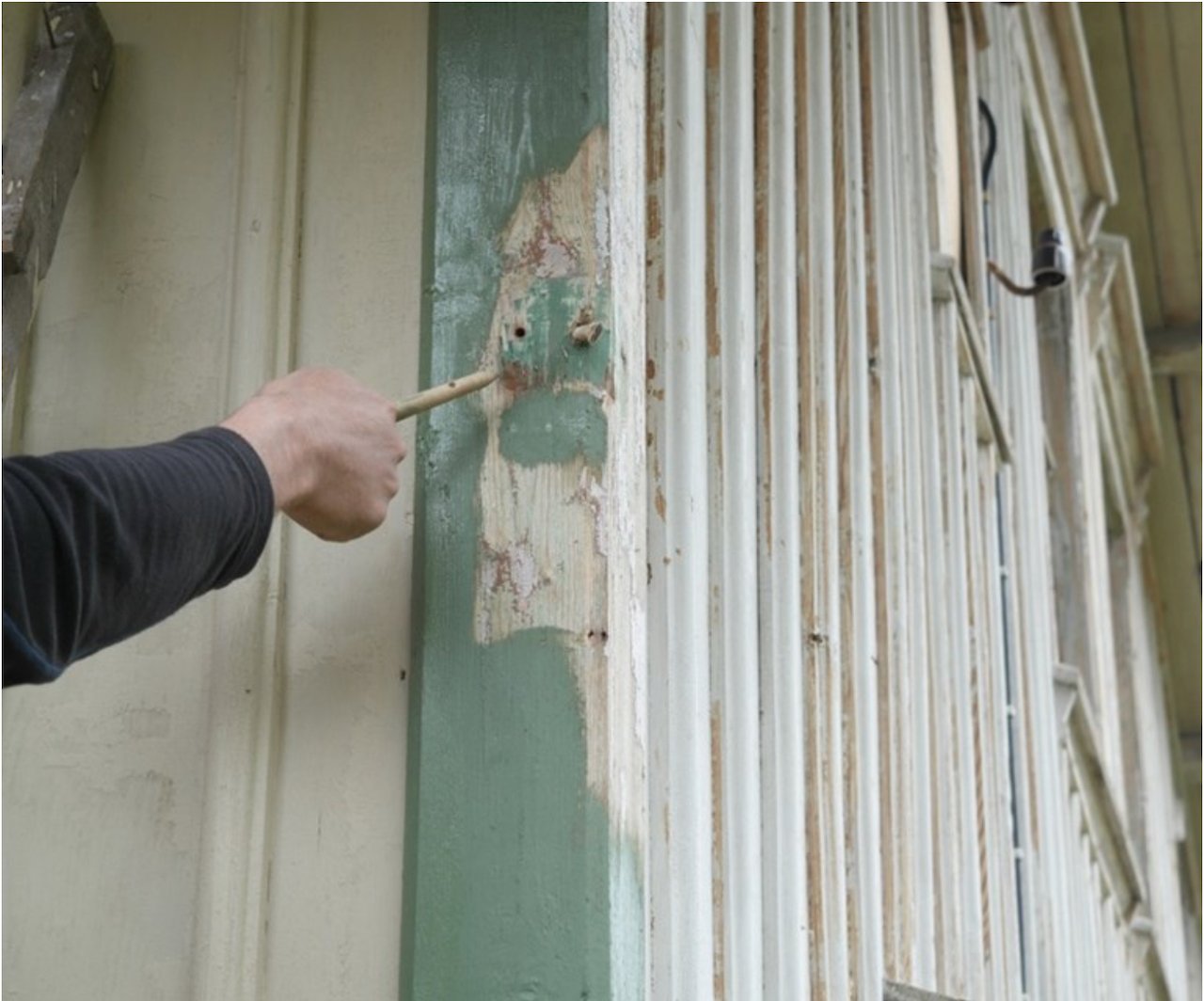
Traces of old paint were found beneath newer layers.
Understand the Role of Pigment
Traditional color choices were grounded in availability and cost. Pigments such as Falu red became widespread not simply for their beauty, but because they were accessible and practical. In contrast, lighter tones - creams, soft yellows, and pale greys - required more refined materials and were therefore used more selectively, often on the main house.
Recognising this hierarchy allows for more informed decisions: color was historically an expression of both economy and intention.
Choose the Right Paint, Not Just the Right Color
Equally important is the choice of paint itself. linseed oil paint remains central to Scandinavian building tradition for a reason. Its breathable quality allows timber to respond naturally to moisture, while its pigments gain depth over time rather than fading abruptly.
Unlike modern coatings, linseed oil paint does not sit as a sealed layer on the surface. It becomes part of the material, ageing gradually - chalking, softening, and developing a patina that cannot be artificially replicated. When selecting colors, this evolution must be considered; the tone applied today is only the beginning of its life.
Work with the Light, Not Against It
Nordic light is both soft and highly variable, shifting dramatically across seasons. Colors that feel balanced in summer can appear stark in winter, while darker tones may absorb more light than expected. Historically, this was understood intuitively. Palettes were chosen to sit gently within their surroundings - never too bright, never too flat.
This is why contrast was handled with care. Window frames and trims were rarely pure white, but instead carried softened tones that complemented the façade rather than competing with it.
Allow for Variation and Imperfection
A historic farmstead was never a perfectly coordinated composition. Subtle variation - between buildings, between surfaces, even between coats of paint - was part of its character. Outbuildings might weather faster, tones might shift slightly over time, and repainting was often done in stages.
Rather than correcting these variations, a sensitive approach allows them to remain. They bring depth, authenticity, and a sense of continuity.
Consider What Should Not Be Painted
Equally important is recognizing when to refrain from painting. Certain elements - secondary structures, fencing, or exposed timber - were often left untreated, allowing them to silver naturally with age. This contrast between painted and raw surfaces creates a quiet tension that enriches the overall composition.
A Living Palette
Ultimately, choosing a historic color palette is not about fixing a house at a single moment in time. It is about entering into an ongoing process. Maintenance, repainting, and gradual change are all part of the aesthetic.
In this sense, the palette is never static. It evolves - shaped by weather, light, and use - just as it always has.
To work within this tradition is to accept that color is not only something you apply, but something that lives and changes with the building itself.