A Quiet Hierarchy of Colour
Historic Farmstead Palettes in Western Sweden
In north-western Sweden, the historic color tradition reveals a refined and quietly structured hierarchy - one where color is not merely decorative, but an expression of function, status, economy, and place within the farmstead.
Swedish rural architecture is strongly associated with red façades. Yet along the western coast, this iconic red was most often reserved for the secondary buildings - barns, hen houses, storage structures, and pig houses.
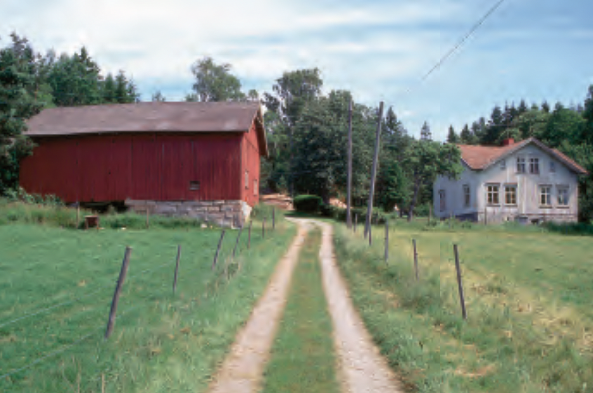
Old barn in Falu red, main house in soft white at the time, around 1950.
The deep, earthy tone - known as Falu red - originated as a by-product of copper mining and became widely used because it was both affordable and durable. Mixed traditionally with water, flour, and iron oxide pigments, it created a matte, breathable surface that protected timber while remaining economical. In a historical context where cost mattered greatly, this made it the natural choice for large, working buildings exposed to constant wear.
These outbuildings were painted with a utilitarian hand - quickly applied, often without primers, and left to weather openly. The finish faded beautifully over time, softening into the landscape and reinforcing the working rhythm of the farm.
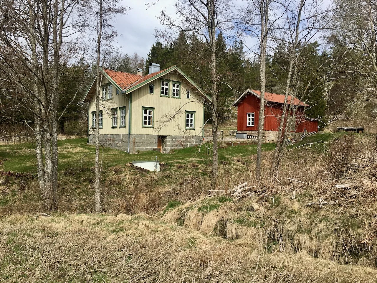
The main house, by contrast, followed a more considered and aspirational tradition. Rather than being defined by red, it was frequently rendered in lighter, more refined tones - soft whites, muted ochres, pale greys, or carefully balanced earth colours. These hues required more expensive pigments and, importantly, were often applied using linseed oil paint, a finish that demanded greater craftsmanship and higher material cost. Linseed oil paint offered a subtle lustre, superior durability, and a depth of colour that evolved beautifully with age. Its use signalled care, permanence, and a certain status within the rural hierarchy.
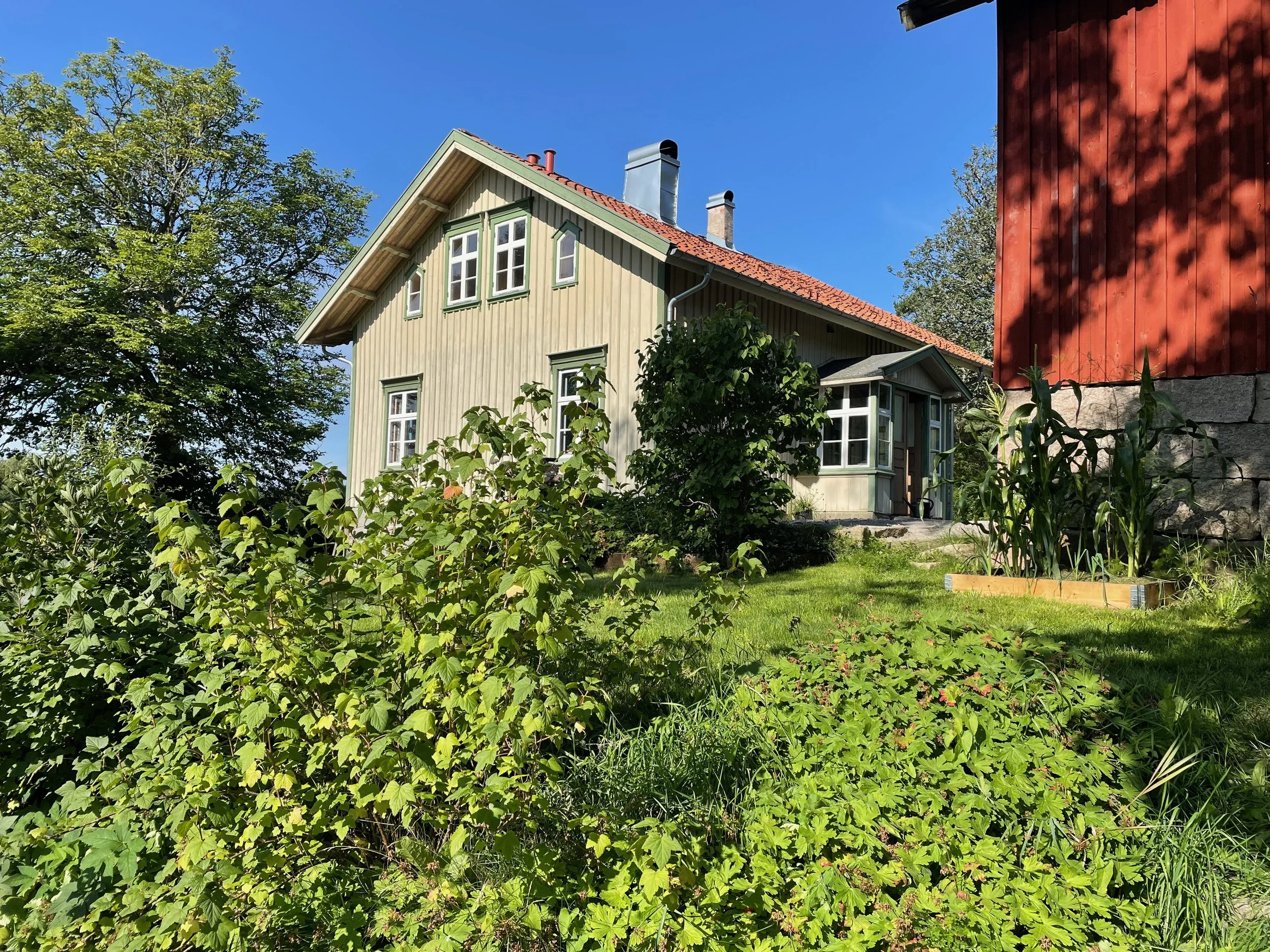
The distinction was therefore not only aesthetic, but economic. Where the outbuildings reflected efficiency and necessity, the main house embodied investment and identity. The finish was more precise, the detailing more deliberate, allowing the residence to stand quietly apart - never ostentatious, but unmistakably central.
This interplay creates a compelling visual composition across the farmstead. The red outbuildings form a grounded and cohesive backdrop, while the main house asserts itself through restraint and tonal refinement. Together, they produce an architecture that feels both ordered and organic - deeply attuned to the shifting light, forest edge, and rocky terrain of western Sweden.
Across western Sweden, this layered use of color reveals a deeper cultural logic: a balance between cost and craft, utility and beauty. Rather than uniformity, the palette embraces variation - allowing each building to express its role, while together forming a harmonious and enduring whole.